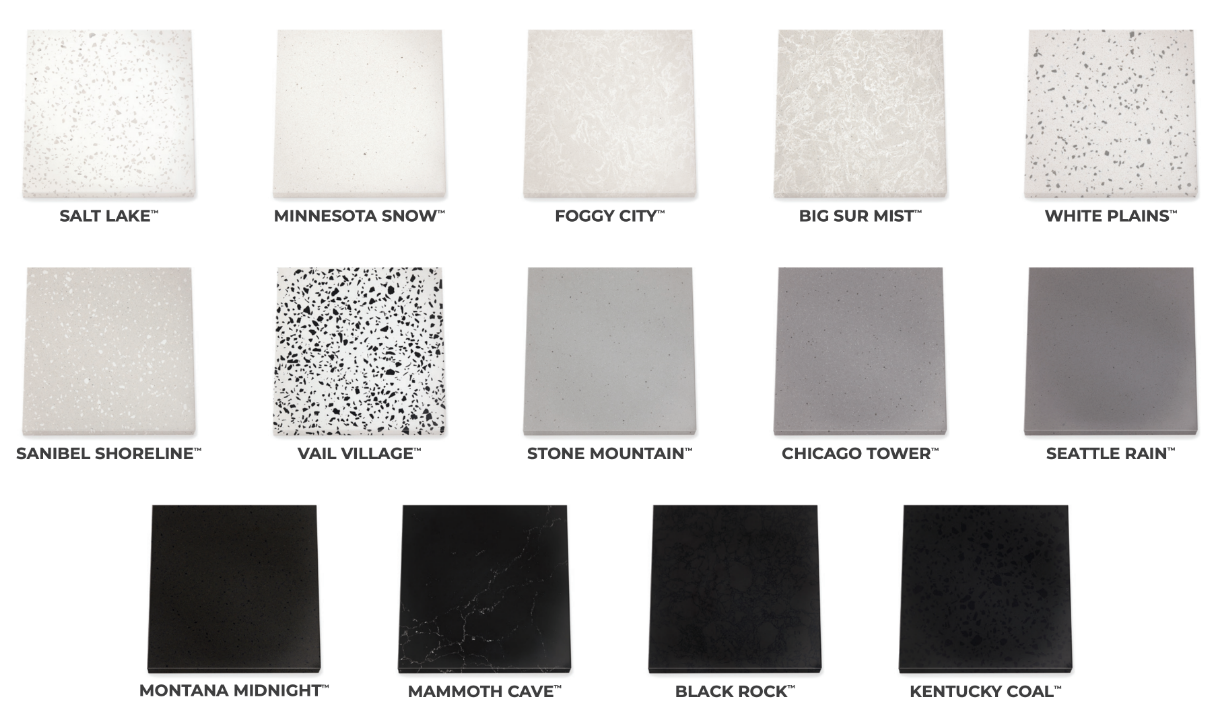
Cambria’s Coordinates Collection - 14 Quartz Surfaces Designed in Collaboration with Gensler

Green Builder Matt Hoots recently collaborated with Cambria’s Field Marketing Director Ellie Knips to bring Rate It Green Members and audience this video introduction to Cambria’s new Coordinates Collection. Inspired by classic and bold American locations and landscapes, these 14 designs are based on the NCS Natural Colour System, and therefore blend together effortlessly. The tones and hues work together in all kinds of light. As Ellie says, “The guesswork is done for you.”
According to Ellie, the Coordinates pallette is modern, and yet subtle and calming, even classic, at the same time. And also the star of the show. All 14 designs are readily available in matte as well, in addition to Cambria’s signature gloss. Two of the designs are made with recycled materials. We look forward to learning more about the story behind these surfaces!
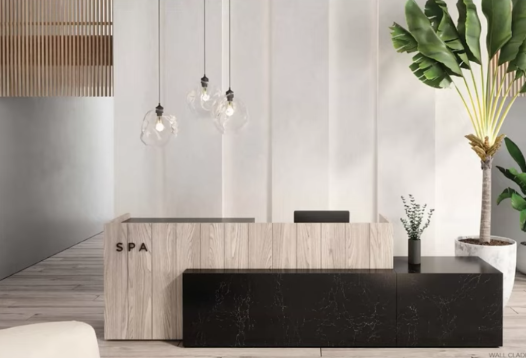
Image: Cambria
Here’s a brief introduction to the 14 Coordinates Collection looks. For more information, visit CambriaUSA.com.
- Salt Lake - A nod to terrazzo, with faint warm dots
- Minnesota Snow - A concrete look in matte, but brighter and smooth, with white dots and larger flakes, softer and more modern than other whites (like Snowden), all in the midst of a wintery white background
- Foggy City - Here’s another great white, tone on tone, with white popping out of a cloudy background, providing depth in design
- *Big Sur Mist - The design is similar to Foggy City with regard to movement, a saturation change, with a grayer dove color. Big Sure is still tone on tone, but it has a little more dimension as the background color is more saturated. The background has a grittiness to it, as it’s recycled.
- White Plains - Also a node to terrazzo looks, but smooth with gray quartz mid tone chips. White Plain’s flakes can remind us of early quartz, but with advancement to a new, calmer level
- *Sanibel Shoreline - Sanibel Shoreline lightens up gray chips with a white tone, like shells dotting the shoreline. This design also incorporates recycled materials.
- Vail Village - This design has a bit more drama, boldness, high contrast. It’s bright white, with dark spots and chunks, and really “puts the punctuation" on all of these designs coordinating together
- Pikes Peak - A gray neutral, with a calming effect, especially in the matte finish, with a concrete feel, but somehow still comforting. Pike’s Peak is not over industrious, but quiet but hard working
- Chicago Tower - Similar to Pike’s Peak but darker. Chicago Tower is dimensional and interesting, even though seems simple. Ellie explains that luxury can be calming…
- Seattle Rain - A darker gray, adding color saturation
- Montana Midnight - Takes gray to a charcoal level, but still has depth/interest
- Mammoth Cave - This design is dark with light white veining; it’s sleek, chic, even quiet, and still impactful
- Black Rock - Black on black veining - tone on tone in a dark spectrum. Black Rock is a layered, unique product and adds interest and dimension in a dark color
- Kentucky Coal - Adds a Terrazzo look in a black on black. This unique design incorporates dark pieces of quartz to achieve a big, bold, dark look
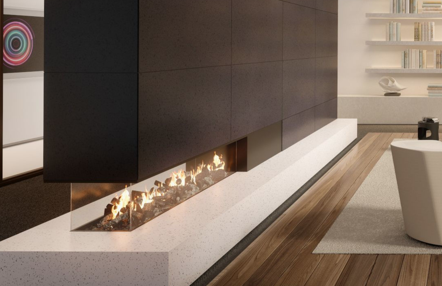
Image: Cambria
Rate It Green Member Cambria works to reduce environmental impact in transportation, water usage, power generation, lighting design, tooling, and materials. To read more about the company’s commitment to sustainability visit: https://www.cambriausa.com/sustainability/#!/.
What is your favorite Coordinates Collection Color? Have you designed with this product? Share your thoughts and an image of your design or installation!
Do you have questions for Ellie? Post them, and let’s have a great discussion so we can all learn more.